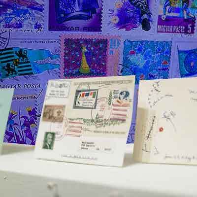
This was the final part of the assignment. I thought it should be at the top. Not that's I'm not proud of my logos... but I think I have some kinks to work out...
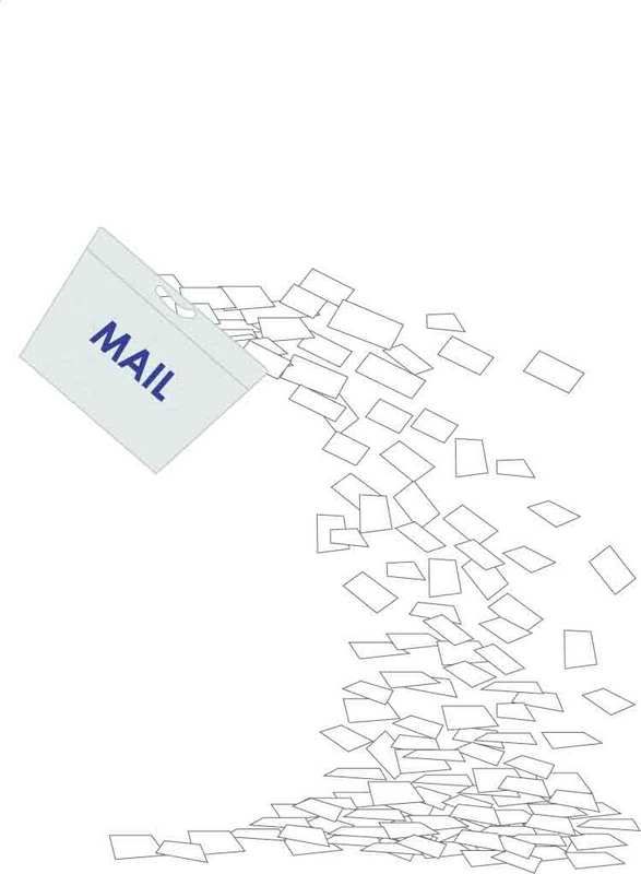
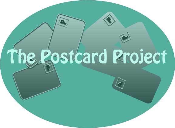
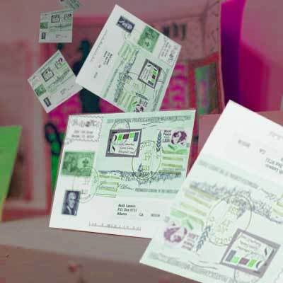
This image is supposed to look like postcards (or any mail), falling out of a box and onto the floor. I could see this becoming some mail-room clip-art some day. (by the way, I have no idea why all that white space shows up at the top... I had a much better use of space in the Illustrator document, but I'll need to figure out how to correct that later.)
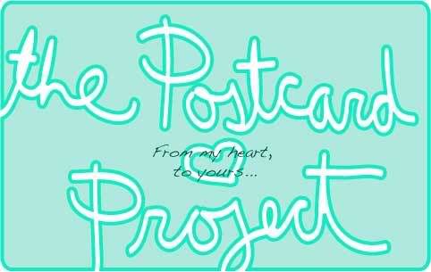
This was the first logo I made. I tried to use postcard shapes in all of my logos. I really liked using the eraser tool in class, so I thought I would use it here. Also, I write with the mouse instead of using the font tool because I hand-write many of the postcards I send out, so I think my handwriting is important to the project.
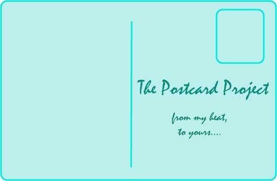
In this logo I was trying to make it look more like a postcard, but the other concepts are the same.
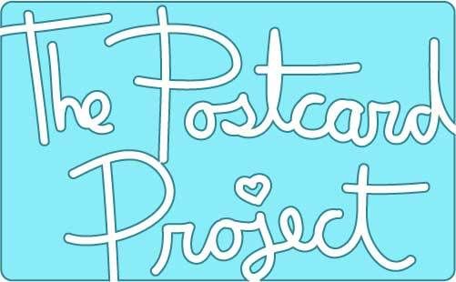
This was actually the last logo I made, and my favorite. I wanted to go back to my original idea after I made the ones you will see next. I may even use this as a button on my website.
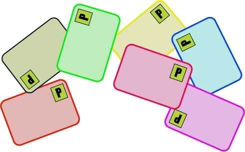
These look slightly more like credit cards than postcards... but whatever... I just wanted to try something different.
I used the postcards from the last one to make this logo. I tried to make it look like a map of the world... but I wasn't all too successful... This was the only time I used any of the "artsy" effects in illustrator, so that was pretty interesting.
 I Love this guy.